
Logo of Son Tra District launched
The Son Tra District Authority held a ceremony on Monday to launch its new official logo in celebration of the 77th anniversary of the National Day (September 2).
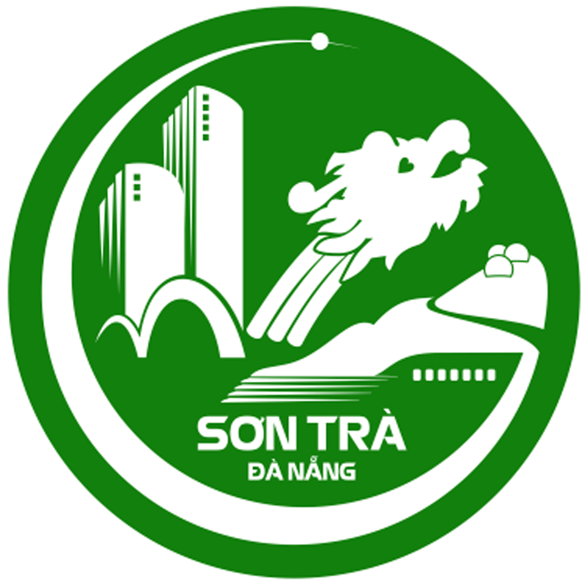 |
| The logo of Son Tra District |
The new logo has green as its dominant colour, indicating the district’s green development orientation. The radial circle with the arc still open to the east shows the direction to the sea
The logo features the images of the Son Tra Peninsula, 3 radar stations on the top of the peninsula, and the Rong (Dragon) Bridge and curved spans, all signifying the prosperity, national strength full of internal force, and the leap of Son Tra District after 25 years of construction and development.
Moreover, there are images of two skyscraper hotels showing the rapid urbanisation speed of Son Tra District. The image of electron represents the direction of digital transformation towards the building of Son Tra District into a smart urban area.
Additionally, the image of wave lines and a cruise ship on the logo signifies the development of the district with a focus on the spheres of tourism, services, commerce and finance associated with the city's marine economy development orientation.
The symbol of 7 doorways of the ship represents 7 administrative units of the district.
Reporting by HOANG HIEP - Translating by M.DUNG